Kinetic Business Site & Checkout
- UX research
- Design
- Telecom
In brief
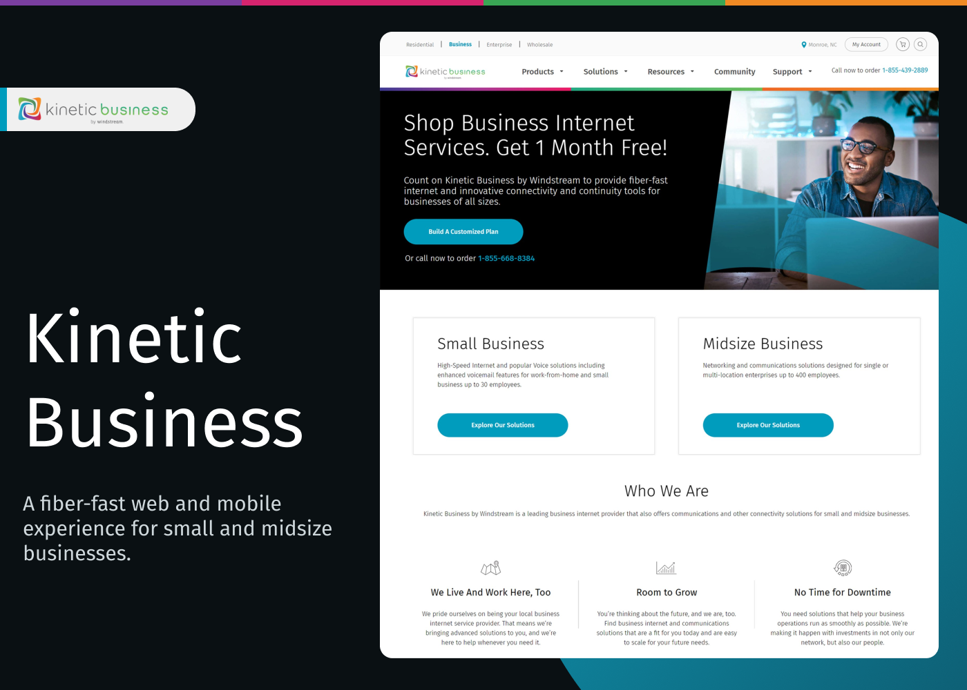
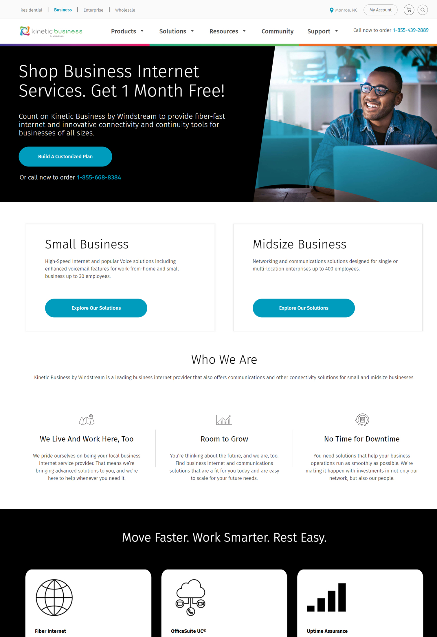
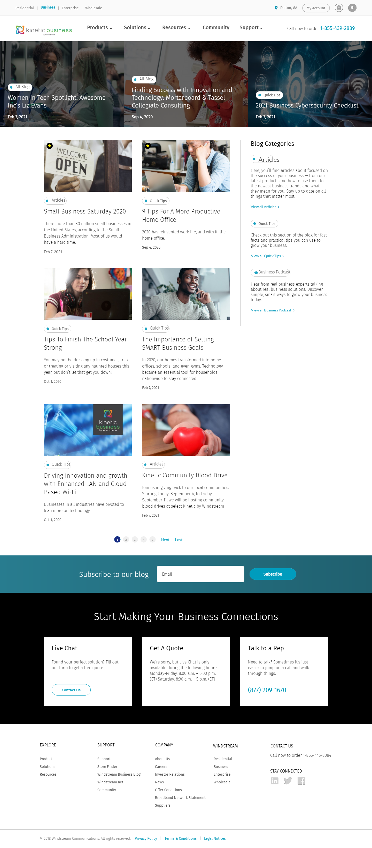
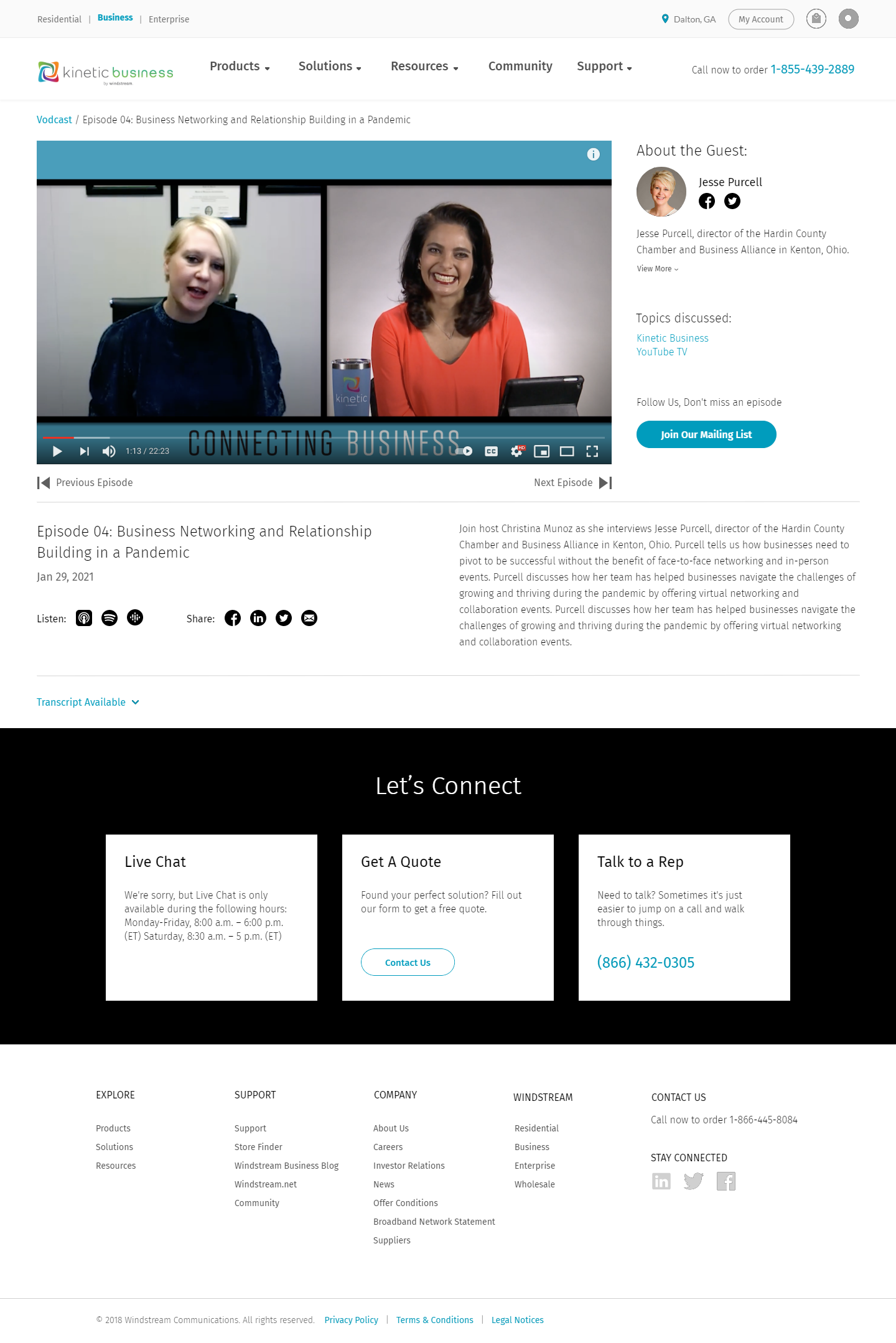
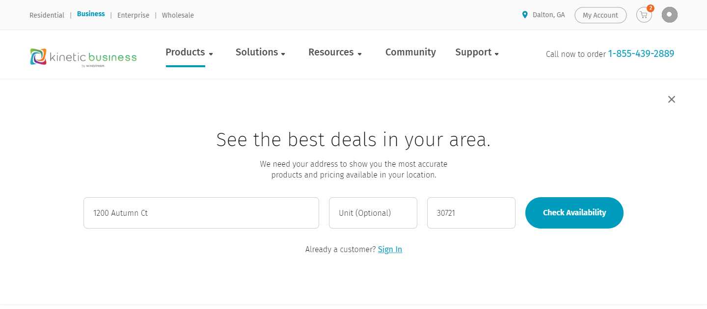
Managed the full design strategy for Windstream’s residential and small-business websites after taking over from another vendor. Improved teamwork under tight deadlines by setting up shared style guides and collaboration tools. Ran user research and created hundreds of designs, from checkout pages to promotional campaigns, to make both websites smooth and easy to use on all devices.
- Design strategy
- Master branding guide
- User research
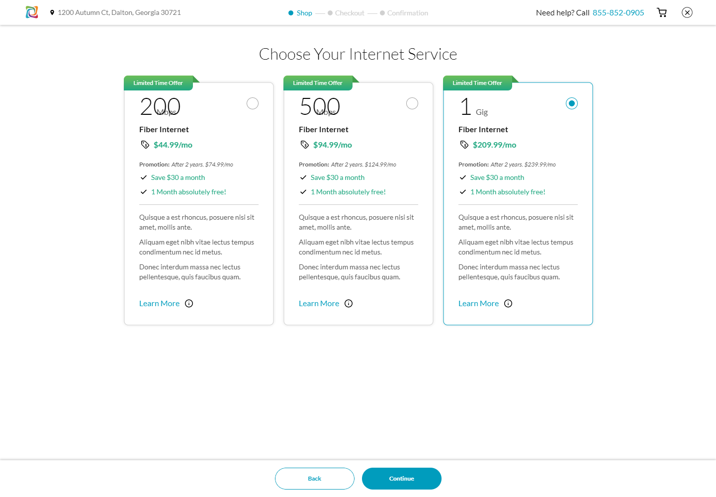
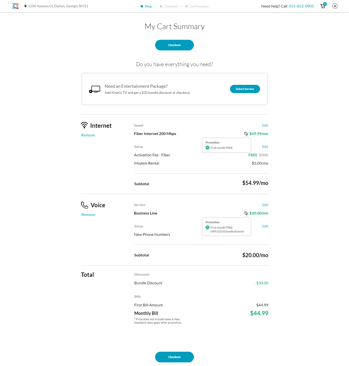
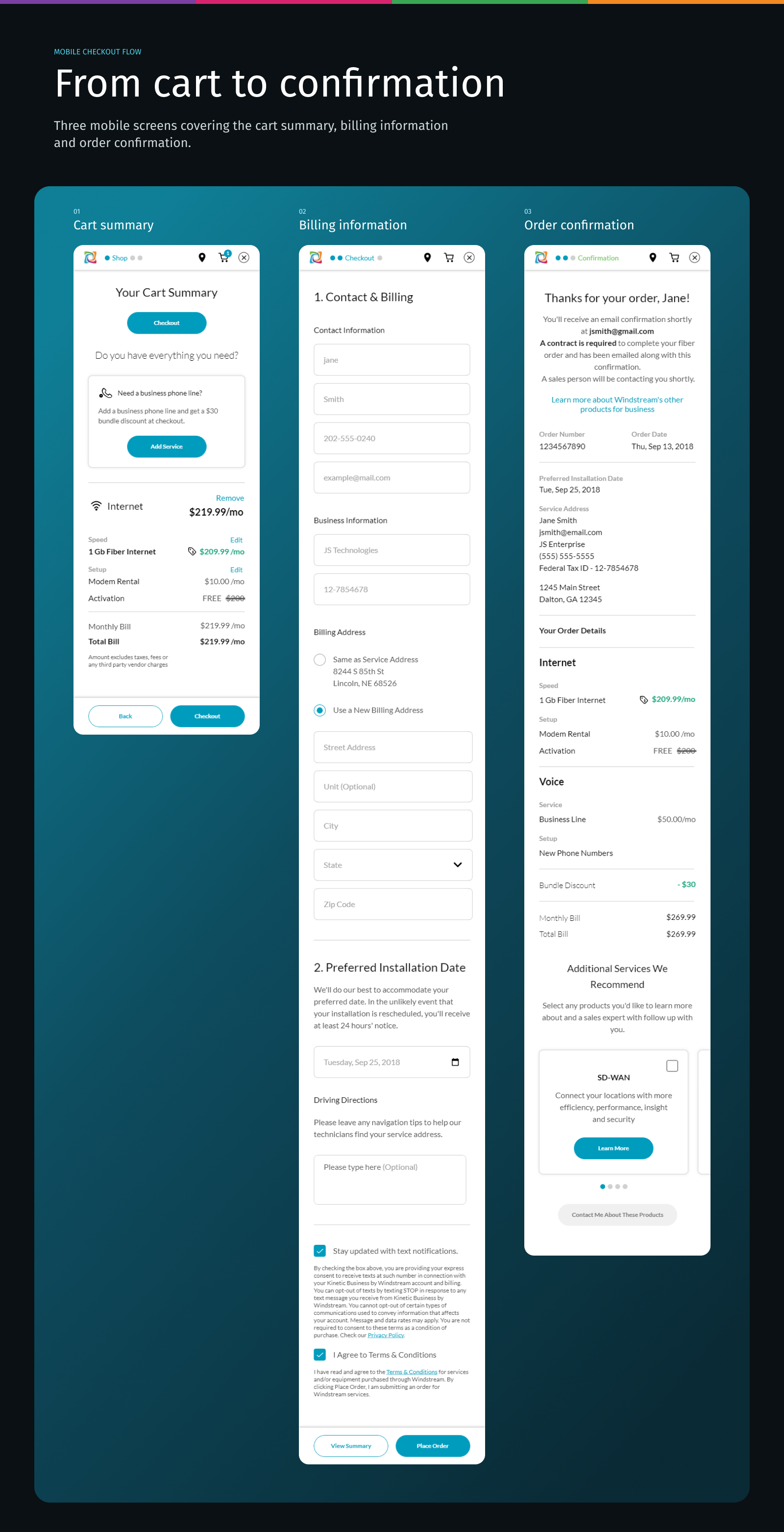
- Checkout design
- Campaign design
- Responsive design
The challenge
Windstream needed to modernize its residential and small-business web platforms across content pages, promotional campaigns, and e-commerce cart and checkout workflows. The project required seamless execution under tight marketing deadlines.
Content pages
Residential and small-business pages to modernize.
Promotional campaigns
Campaign designs delivered on marketing deadlines.
Cart and checkout
E-commerce workflows made smooth on every device.
The strategy
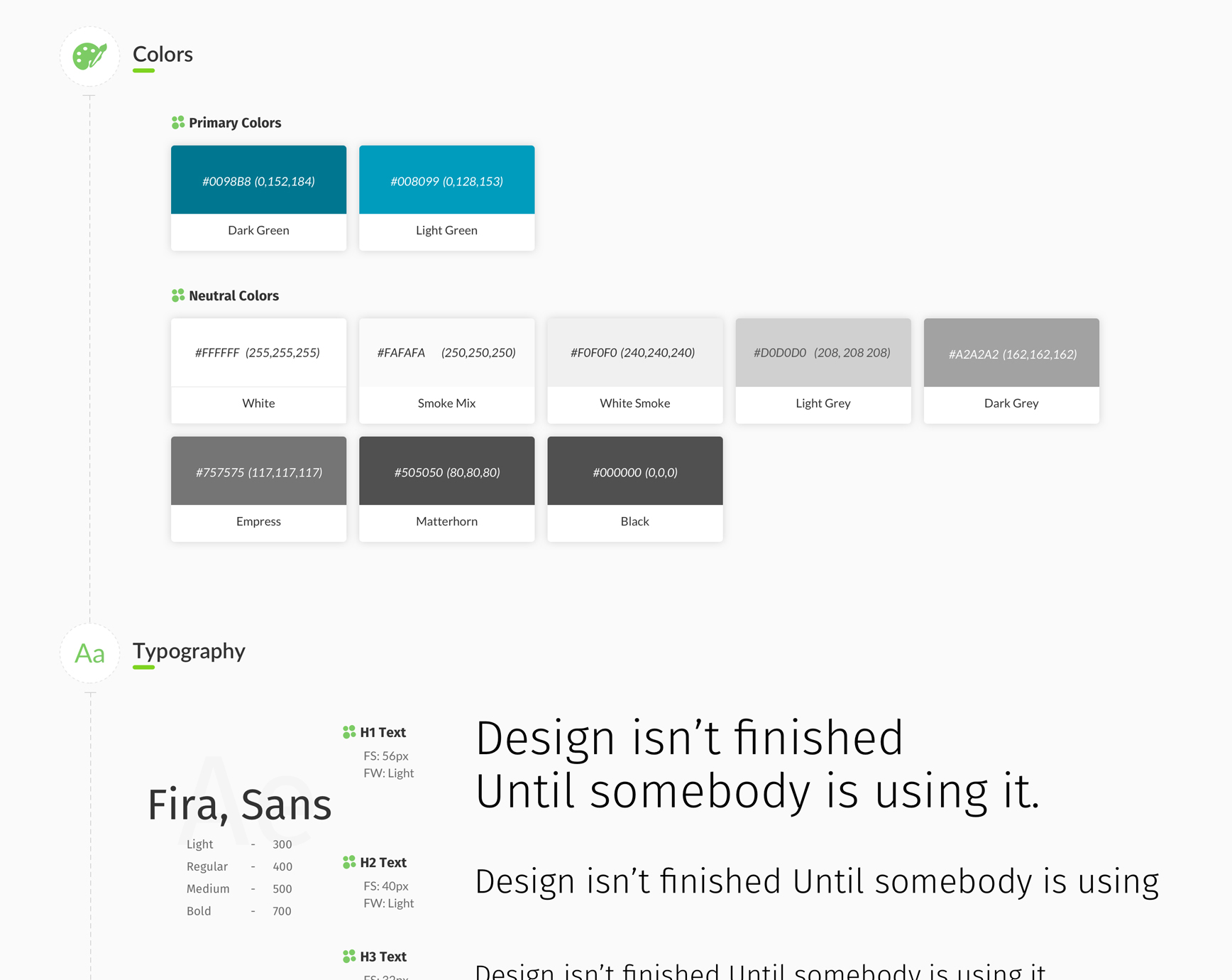
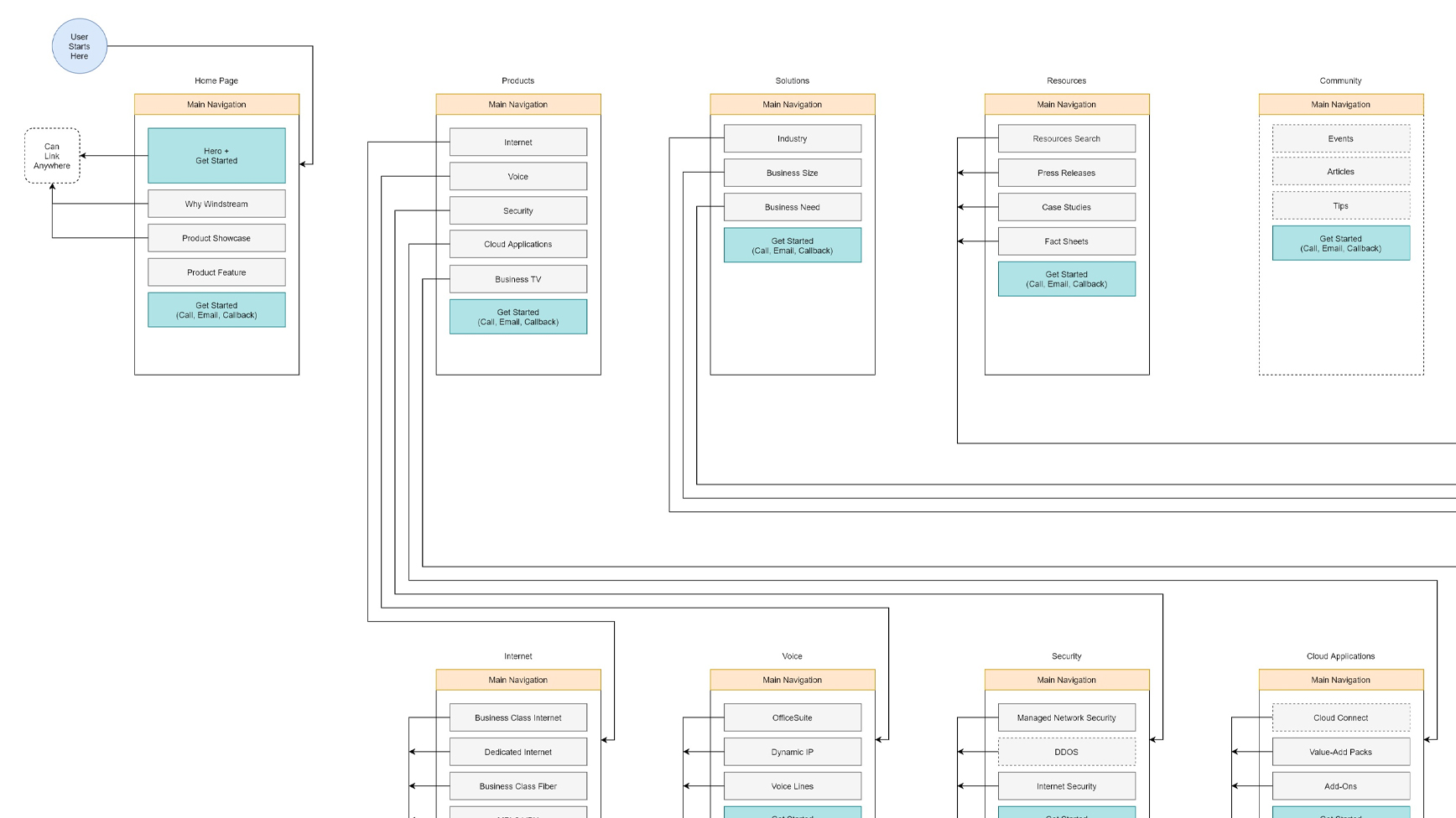
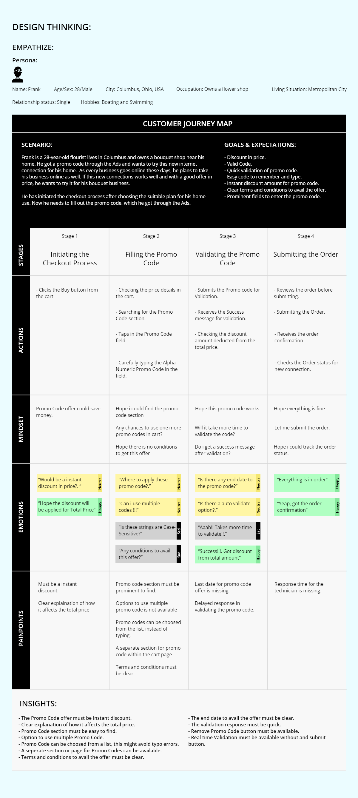
Created and distributed a comprehensive master branding guide across all internal and external departments to ensure visual harmony and brand consistency. Spearheaded proactive user research despite quick turnaround times, giving the business data-backed design recommendations and tools to track long-term user metrics.
The impact
Transformed two fragmented, complex websites into intuitive, highly responsive, and enjoyable digital experiences that scaled effortlessly across all devices.
Key outcomes
One brand language
A shared master branding guide kept every team and vendor visually aligned.
Evidence, not opinion
Proactive research gave the business data-backed recommendations and long-term metrics.
Every device
Two fragmented sites became responsive experiences that scale across screens.